top of page


Text description provided by the architects.

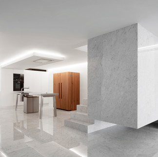
The project consists in the refurbishment of a penthouse located in the Costa Blanca of the Mediterranean Sea. The main floor, articulated in a single room, seeks continuity between the kitchen, the living room, the terrace and the landscape. On the upper floor, where the night area is located, the master bedroom opens out to the sea through a terrace and has a large dressing room that meets each one of the clients' preferences.


In order to delimit the spaces different elements are used. On the one hand, the staircase, made of white stone, conceived as a sculptural element that, together with the kitchen as furniture, allow the use of spaces.


On the other hand, a black stone element includes the humid areas and serves to configure the space of the master bedroom. Boosting the views of the Bay of Altea becomes the last and most important element of this proposal.


11 views0 comments
fernando3723


When Chef Austin Johnson and Master Sommelier Dustin Wilson conceived the atmosphere at their new restaurant One White Street, they turned to Richard Felix-Ashman Design to elevate the atmosphere of a restored townhouse in Tribeca to a mindful space focused on the experience of gathering to enjoy food and wine.


We pulled Richard aside to get his perspective on fine tuning design elements at home to foster a welcoming environment for wine tasting parties or wine dinner gatherings. Here are his top five tips to level up any space for an ideal entertaining haven:


1. The key factors should be the food, wine, and your company.

The interior design is a complimentary frame experience — it should not compete. When designing, Richard asks himself: “How can design elevate the experience, without being the dominant influence on memory?”


2. Good interior design enhances personal experience in layers.

Layering adds balance and depth to a space. The soul of the space, however, is always the people and their experience.

  1. The first layer is spatial. Organizing the seating and circulation in a harmonious way enhances ease of movement and respect for personal space.

  2. The next layer is warm and clear lighting. Combine different strata of lighting from daylight through ambient lighting to decorative pieces which act as jewelry within the space. Each has its own function, and as a whole creates a comforting environment.

  3. Finally we consider materials, furnishings, and color. These should be appropriate to the space and to the guest – it’s an interplay of these three that gives human scale and comfort.

  4. For texture, the use of simple, natural materials is vital: wood, stone, wool, ceramic, and brass. These are materials that are familiar, domestic, and honest. Natural materials have their own beauty and character. They are not precious, and can be touched without concern. They age gracefully. Keeping the tonality light and neutral also showcases the experience within the space, so keep the perimeter as clean as possible. Use blocks of color strategically, so that the eye doesn’t dart around the space too quickly. Strive for calm and natural interiors which I hope bring comfort and ease to the guests.


3. Focus the table’s attention inward, showcase the food and wine with beautiful plates, glassware, and small taper candles. To add warmth to a room, I love Akari paper lamps for their glowing softness. They are an investment, but will last lifetimes if treated with love, and they compliment any style of interior. Place one on the floor or on a sideboard.


4. Last but not least: for a personal, tactile experience, there is nothing more reassuring than a 100% linen napkin. March has beautiful, ethical options from natural to indigo. Lastly, have a few small, soft linen pillows available as bolsters to offer to guests for added comfort and support.


Source: vervewine.com


62 views0 comments


text description provided by the architects.

Nestlé and Très Arquitetura open the doors of the exclusive 'Casa Grão by Starbucks at Home' at CASACOR 2019, the largest architecture, decoration, design and landscaping event in Latin America. This year's show was based on pillars such as affection, sustainability and technology, intrinsically linked to the brand's consumer profile, eager for new experiences and seeking to always be ahead of trends, but without neglecting the planet. To design the house, Starbucks at Home found the ideal partner in Très Arquitetura, as it is recognized for its clean, minimalist, elegant and sustainable architecture.


Building their first complete residence at the event, architects Fernanda Tegacini, Fernanda Morais and Nathalia Mouco were guided by the concept of the grain (Grão), which names the project. In addition, the premises of a generation that seeks a more detached, altruistic and humanized life, and the lines of the Pavilion of Mies Van Der Rohe, in Barcelona, also inspired the 1000sqft dwelling in the shape of a glass box, which encompasses living, dining room with a small kitchen and master suite. The light, dry and sustainable iron structure was reused from an old shopping mezzanine, and demonstrates the office's technical competence.


Natural materials, almost rustic, communicate the core values ​​of the brand in a very direct way, glorifying their products and the casual nature of the trade, bringing an approximation of nature with the individual.


Two main gables of Brazilian marble (Donatello by Brasigran), support this skeleton, which was closed off by large glass frames, which integrate the beautiful landscape of the garden by Bia Abreu into the décor. The composition of the interior still has few furniture, and as a great highlight the modular sofa, made in partnership with Líder Interiores, which takes care of the center of the living room and allows the interaction, from any angle, of the people who sit there, in addition to guide the flow of activities around you.


The ceiling lining was designed with walnut leaves, creating a contrast with the floor and the color palette that transitions between black and white. In the dining room, the table has four chairs, two covered in a fabric with a dark green tone, and another two in black, creating a subtle connection with the iconic green pantone of Starbucks, conceiving a more intimate and modern space. Facing it, an imposing bookcase, designed by the architects, illustrates the firm's expertise in carpentry, its trademark, and boasts design and decoration elements and objects, subtly arranged in niches and compartments.


In addition, it works as a large window for a mini 'forest', provided by the partner landscaper, framing the green and incorporating it into the decor.


Still creating an interaction between the architectural design and Starbucks' familiar visual identity, one of the main fencing gables, which separates the social area from the intimate, was painted in the dark green color characteristic of the stores.


The entire architectural concept was conceived not only as a point of sale, but as a meeting place, a place to feel at home. We strive to make natural and green materials present through architecture as central and prominent elements.


In a way, we seek the idea of ​​breaking away from the food alienation experienced by the inhabitants of the great cities as inspiration. Evidencing the origin, the origin of the food. The colors and textures of the products are decisive for the decoration of the store."


44 views0 comments
Doral Stones Logo
bottom of page